4 Logo Design Tips to Improve Your Brand Image
Building a brand requires a great amount of time, effort, and investment. Between creating a product or service, identifying your target audience, and building your website, you might wonder whether designing your logo is equally important.
Make no mistake, it is very important as it is an image that links your brand to its consumers and often presents the first impression of your brand.
Ideally, you want your logo to appeal to your target audience, be memorable, distinct, and recognizable. Of course, it is easier said than done, but these four tips on logo design should definitely make your journey way smoother.
- Ask yourself the right questions
- Choose the type of logo that fits your brand
- Understand the psychology behind the colors
- Research your competition
Table of Contents
1. Ask yourself the right questions
Before you do anything, ask yourself the following questions so that you can have a sense of what type of logo to design for your brand:
- What is the story behind your brand?
- Who is your target audience?
- What feelings would you like to evoke in people when they look at your logo?
- What values do you want your brand to convey?
- Are there any unique characteristics to your brand?
The answers to these questions will help you decide on the color, shape, and typography to use when designing your logo.
While you are in this phase, consider hiring a brand identity agency to help you understand your brand’s needs better and to avoid any mistakes.
2. Choose the type of logo that fits your brand
There are six categories of logos:
1. Monogram logos
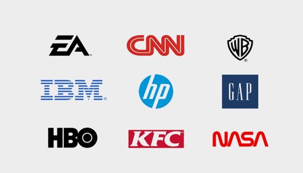
Monogram logos, also known as letter marks, are presented in letter form and typically involve brand initials.
This type of logo is very convenient for companies with long brand names. Imagine how difficult it would have been for KFC to incorporate their full name, “Kentucky Fried Chicken,” into their logo. With a monogram logo, their brand is still strong and recognizable.
A monogram logo is suitable for well-established brands. However, if you are only just started to develop your business, consider adding your full business name below your logo so that you can gradually build brand awareness.
2. Wordmarks
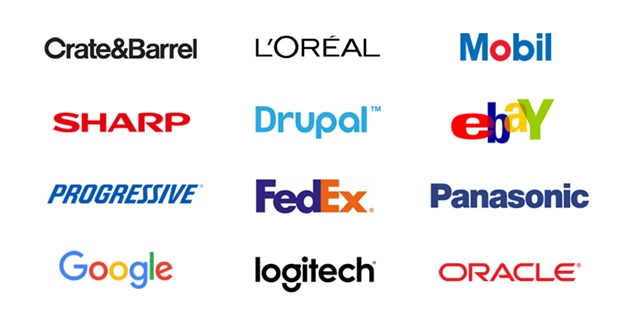
Much like monogram logos, wordmark logos are also letter-based, but they incorporate full brand names.
This type of logo must be combined with the appropriate typography.
In the words of Michael Evamy, brand copywriter and storyteller: “Words carry meaning; fonts convey character.” For instance, if you are in the fashion business, your font should be clean and elegant and convey luxury.
You can also notice how technology-based businesses such as Sharp, Panasonic, and Logitech all have precise and sharp fonts, while Google and eBay logos font look fun and playful as they aim to appeal to everyone.
This type of logo is more suitable for brands with short, concise names.
3. Pictorial marks
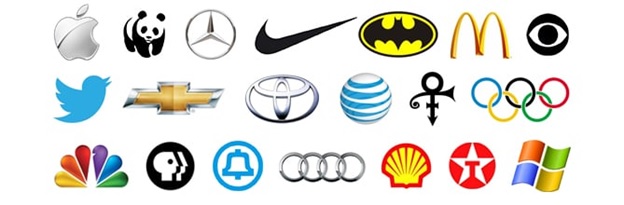
This type of logo is based purely on symbols, some of which are in defined form (Twitter, Apple, etc.), while others are more abstract (Nike, Mercedes, etc.). The most common journey for this type of logo success is a step-by-step approach.
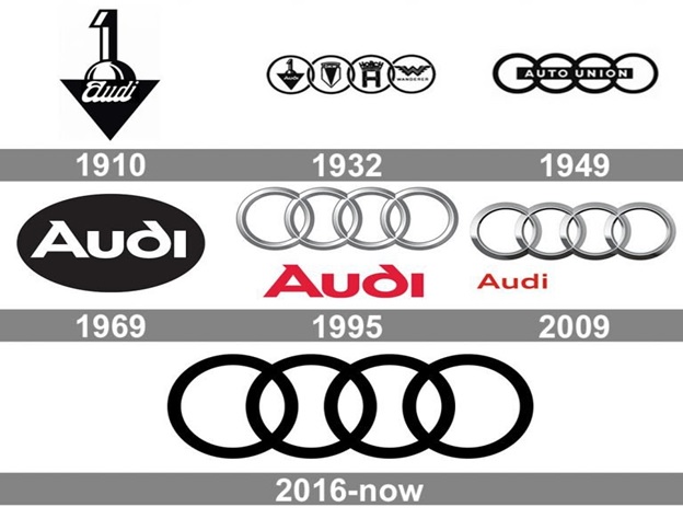
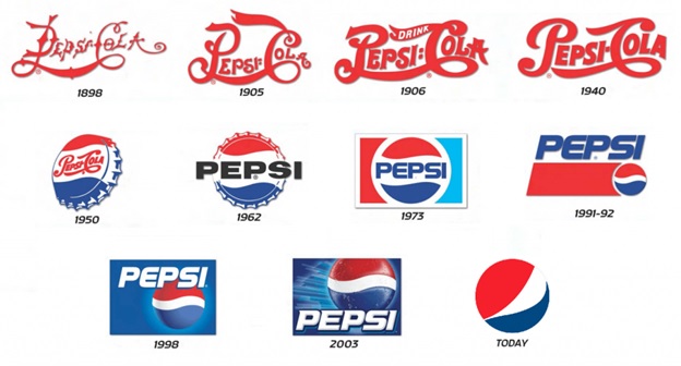
As we can see on the images above, both Audi and Pepsi reached their current logo recognition by gradually simplifying it until all that is left is the symbol.
The strengths of this logotype are its level of diversity and the ease of incorporation into marketing materials. Still, if you choose this route for your brand, consider the time required for such a logo to become easily recognizable.
4. The emblem
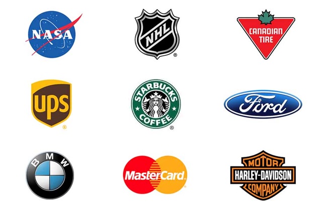
This type of logo uses both symbols and text. The text is often placed within the reef or a shield, thus creating an inseparable bond between the two.
It is mostly regarded as a traditional logo design as it is used for schools, government, sports teams, and other organizations. Still, as we can see in the image above, modern brands implemented this type of logo successfully.
This type of logo has the power of representing your business as reliable, valuable, and safe. If you decide to design an emblem type of logo, consider using clear typography to make letters visible when scaling the logo.
5. The combination mark
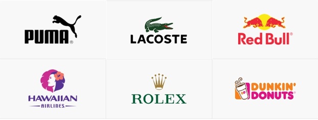
This type of logo is somewhat similar to the emblem. The main difference is that the text in the combination mark logos isn’t placed into the symbol itself; instead, the text and symbol act as separate units.
Choosing a combination mark logo design can be beneficial as it allows you to eventually eliminate the text and still have a logo that will be associated with your brand.
6. Mascot
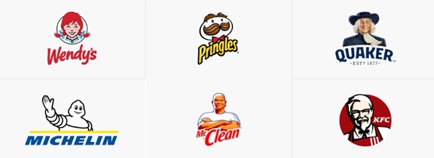
A mascot type of logos uses the illustration of animals, inanimate objects, and humans. These are known to be colorful, playful, dynamic, and vivid.
Choosing this type of logo will make your brand look more approachable and friendly.
3. Understand the psychology behind the colors
The colors are a big part of the message you try to convey about your brand through your logo, as the logo relies on visual recall more than anything. Each color stirs different emotions.
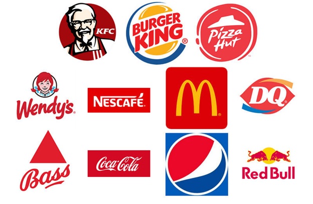
Red invokes very strong feelings such as passion, love, power, etc., so it is not a surprise that many companies use red in their logos.
White is commonly associated with peace, simplicity, purity, etc. When it comes to logos, white is often used in combination with black as negative space.
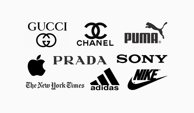
- Silver is perceived as the color of wealth, elegance, sophistication, and luxury. In logos, silver is mostly used for industrial and technology-based companies as well as in the jewelry and fashion industries.

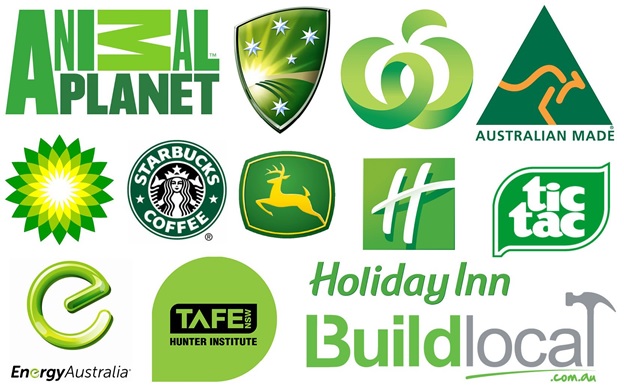
Green symbolizes growth, health, money, hope, etc. Companies with the green logo are considered eco-friendly. Using green in the logo makes a brand more trustworthy, natural, and secure.
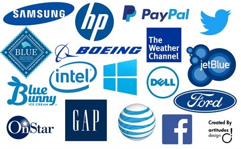
Blue invokes the feeling of professionalism and trust; that is why it is used by many major companies as well as small businesses.
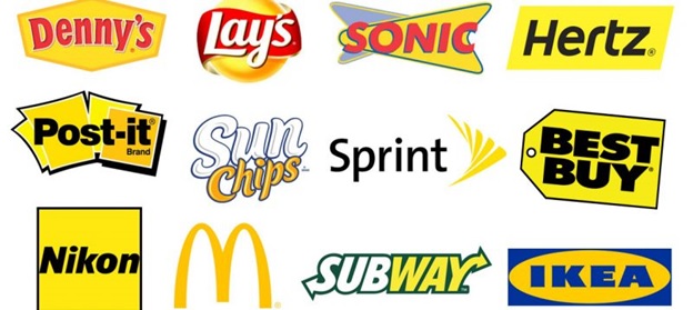
Yellow is considered to be a warm color that evokes a feeling of joy and friendliness. Brands that use yellow for their logos want us to see their companies as pleasant, fast, and accessible.
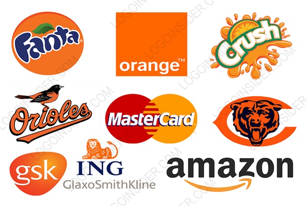
Orange is perceived as a playful and energetic color. This color is used a great deal in logos as it represents determination, creativity, and enthusiasm.
When choosing the color for your logo, think about the kind of message you want your brand to convey. Then, implement the colors that will best represent what your business is about.
4.Research your competition
Research your direct competitor’s logos to find out what is similar between you and what sets you apart.
Researching your competition gives you an insight into the starting points for your logo design while saving you time and effort.
Conclusion
A logo is very important as it is the foundation of your brand. It conveys your brand’s story, value, quality and serves as a connection between your brand and its consumers.
In the words of graphic designer Paul Rand, “A logo doesn’t sell. It identifies.”